Sumup & Pix
Project Context
As part of my UX/UI specialization, I designed a landing page and an email marketing campaign to educate SumUp’s micro-entrepreneurs about using Pix for payments. Although it was a design-focused exercise, I was already exploring product-thinking skills that would become essential in my future as a PM.
Problem Description
SumUp, which focuses on small business owners, needed to encourage the adoption of Pix as a payment method. Although Pix is widely popular in Brazil, many SumUp merchants were not yet using it on their card machines, either due to a lack of awareness of its direct business benefits or the absence of clear communication.
Solution and Process
Again: although I was wearing the UX Designer hat at the time, today, as a Product Manager, I see this work as a mini “product launch” that combined user research, design prototyping, brand strategy, shaping content, interaction flows and visual style.
The Challenge:
Content clarity: Merchants were unfamiliar with Pix terminology and its setup steps.
Brand alignment: We needed a seamless blend between SumUp’s brand and the Pix visual identity.
Conversion focus: Every element, from hero text to CTA, had to drive sign-ups.
The Opportunity:
Increasing Pix usage could lower transaction costs for SumUp, accelerate settlement times for merchants, and improve the payment experience for the end consumer. This would create more value and drive platform loyalty.
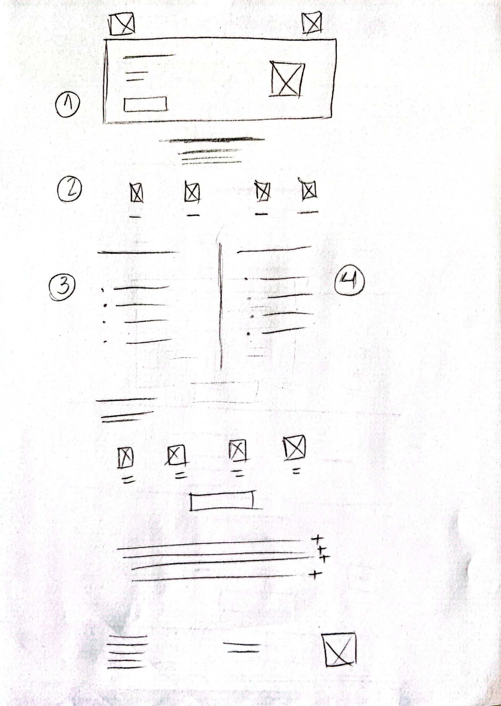
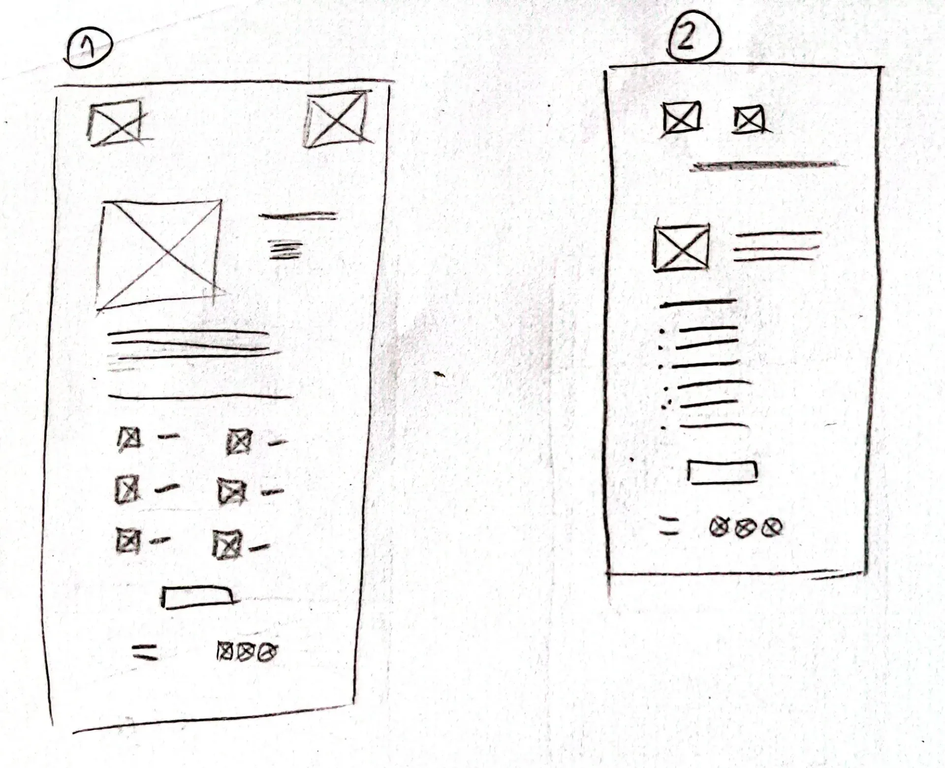
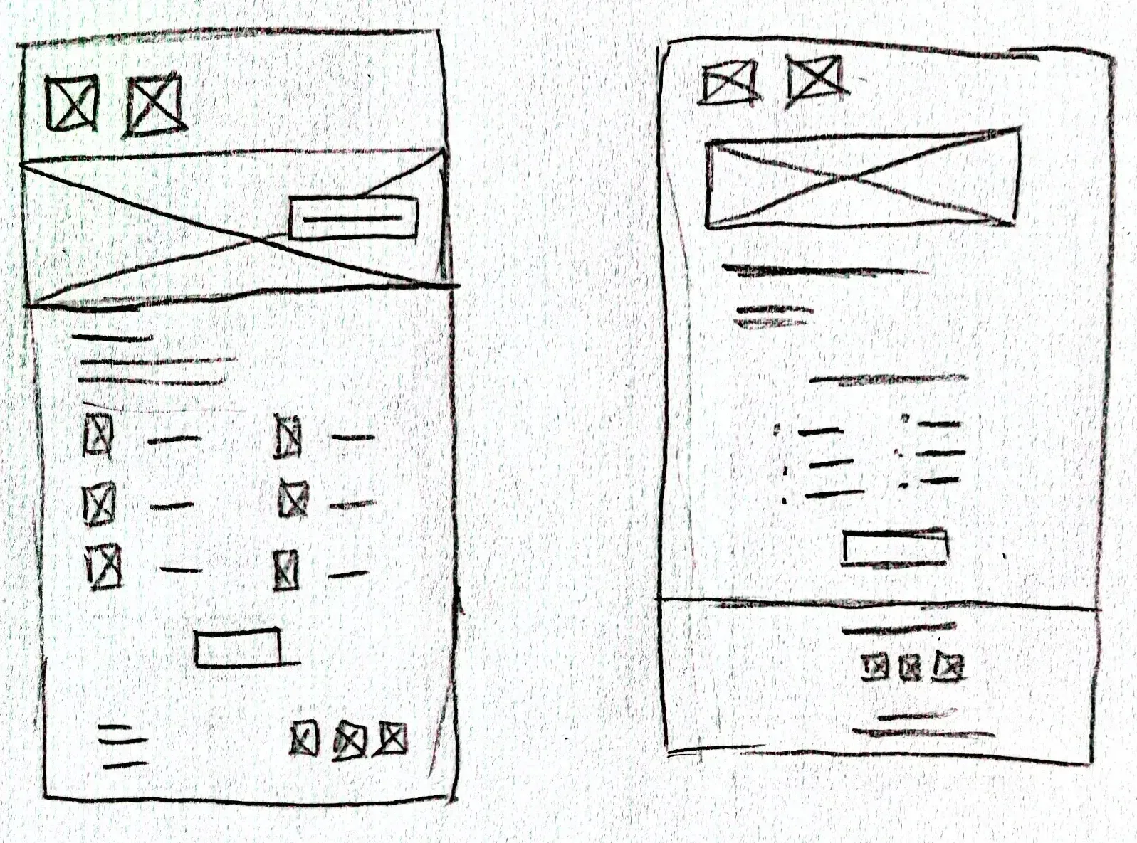
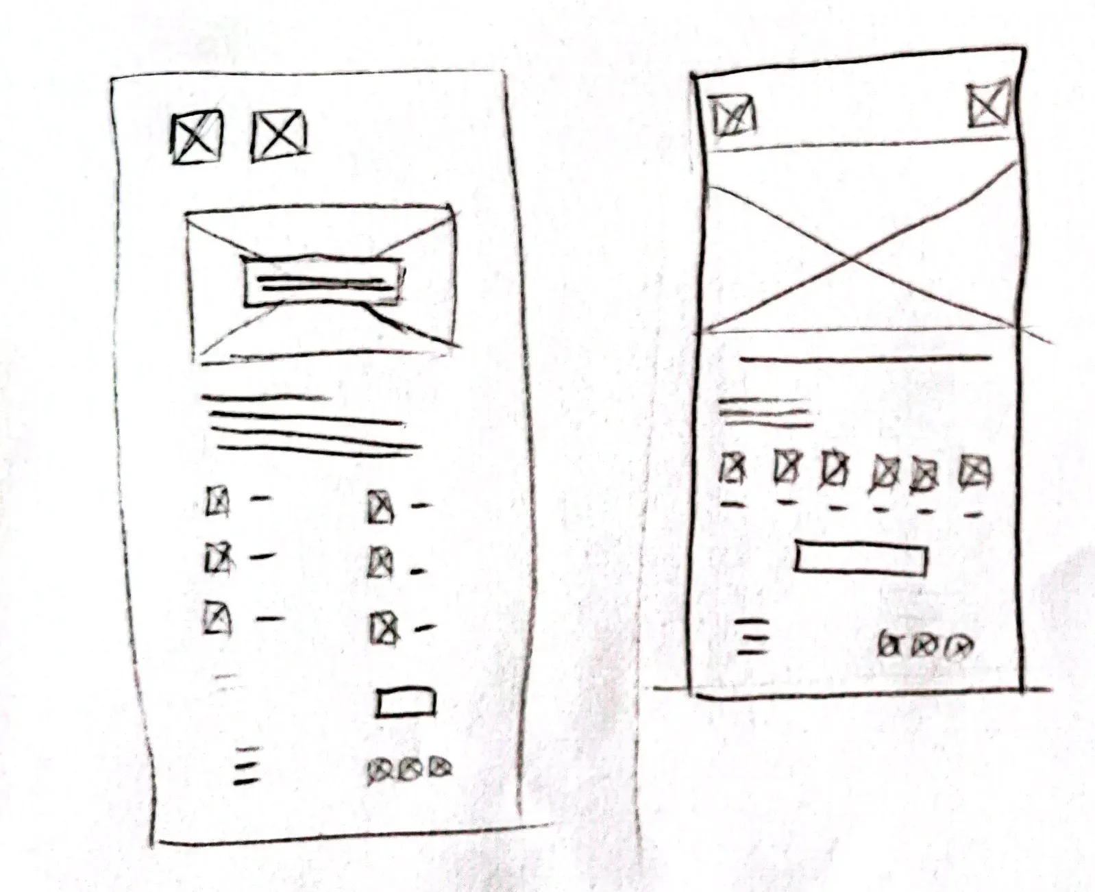
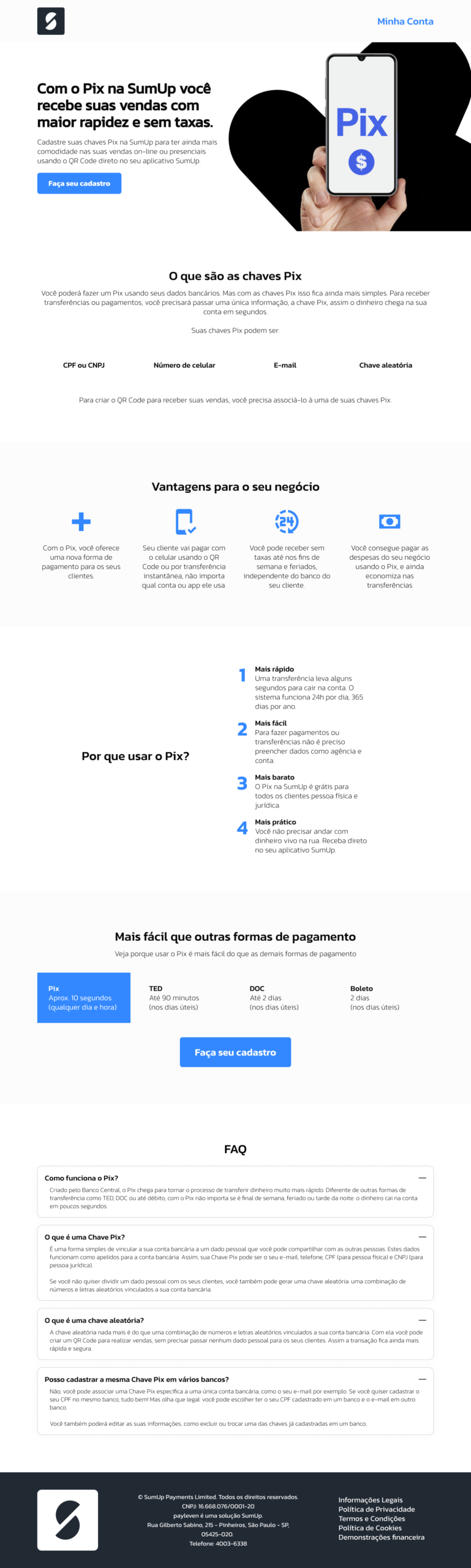
Low-Fidelity wireframes
- Reviewed the brief and gathered all required copy points (Pix definition, benefits, Pix keys setup steps).
- Sketched wireframes to map where each message and asset would live: headlines, explanatory panels, step-by-step visuals, and CTAs.
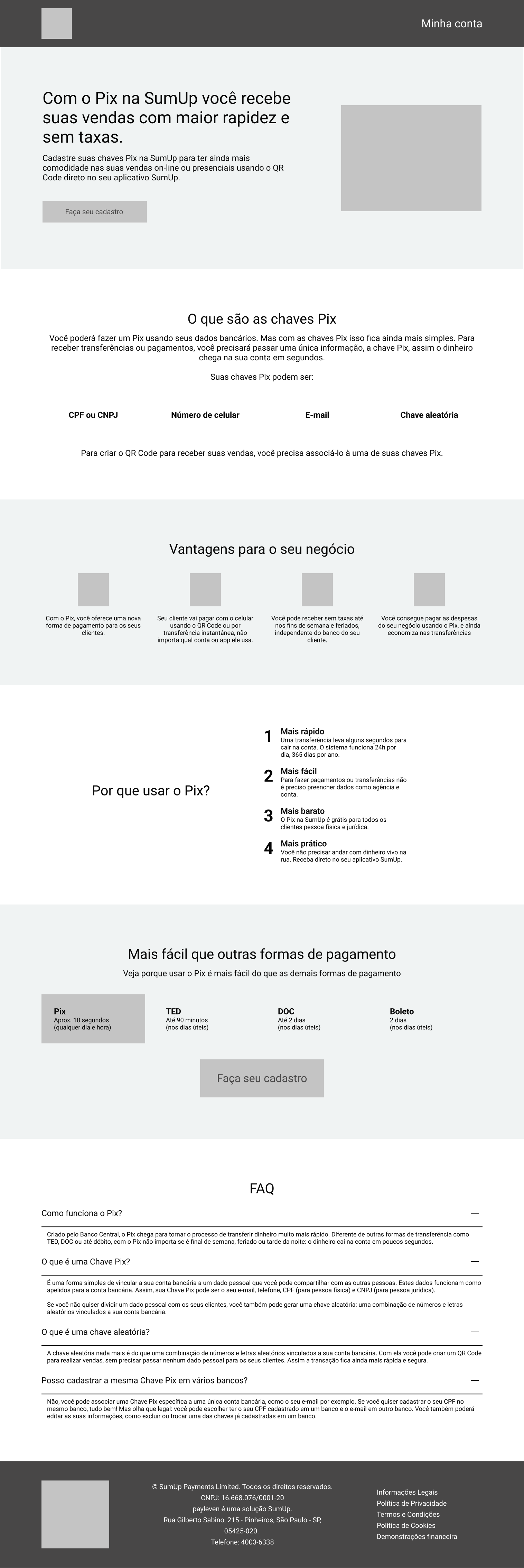
Landing Page
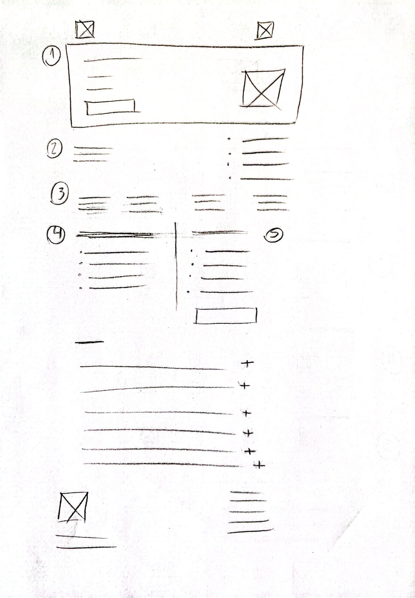
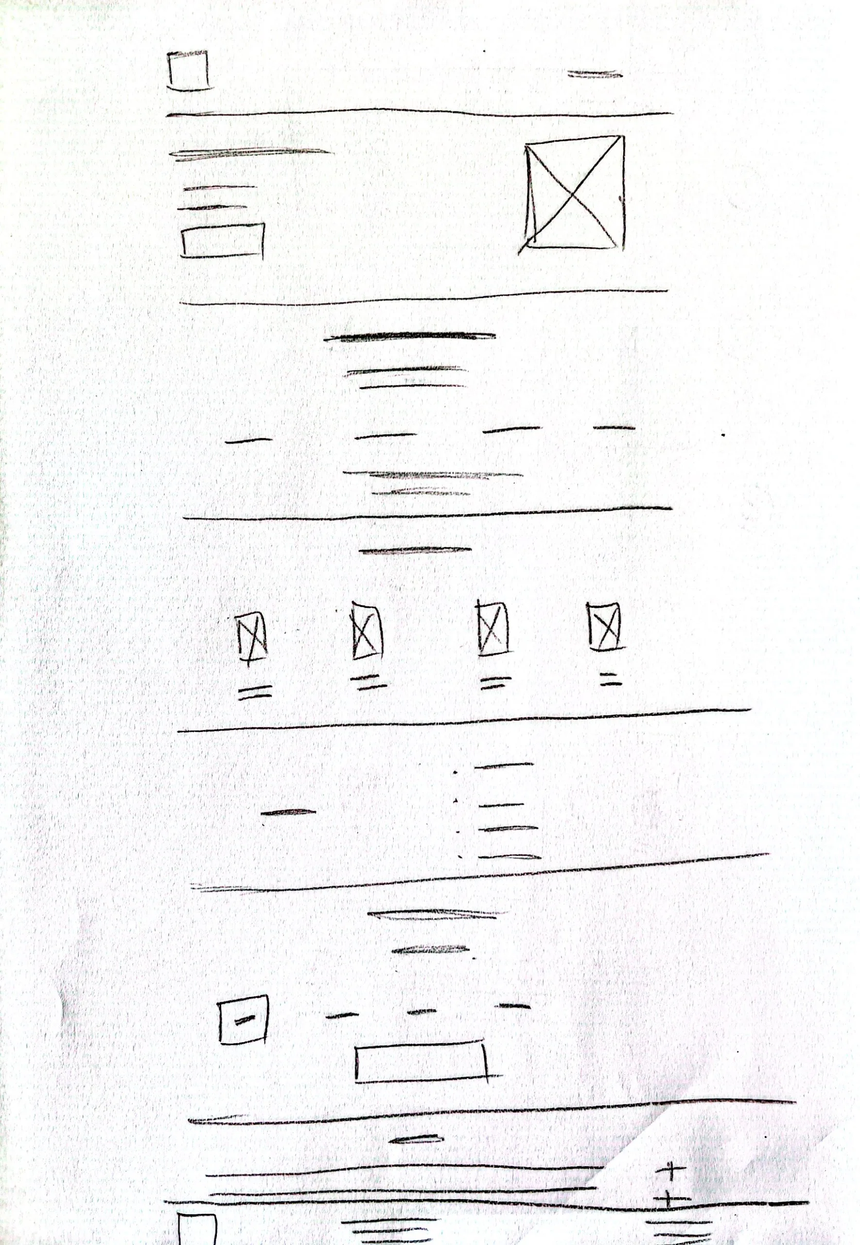
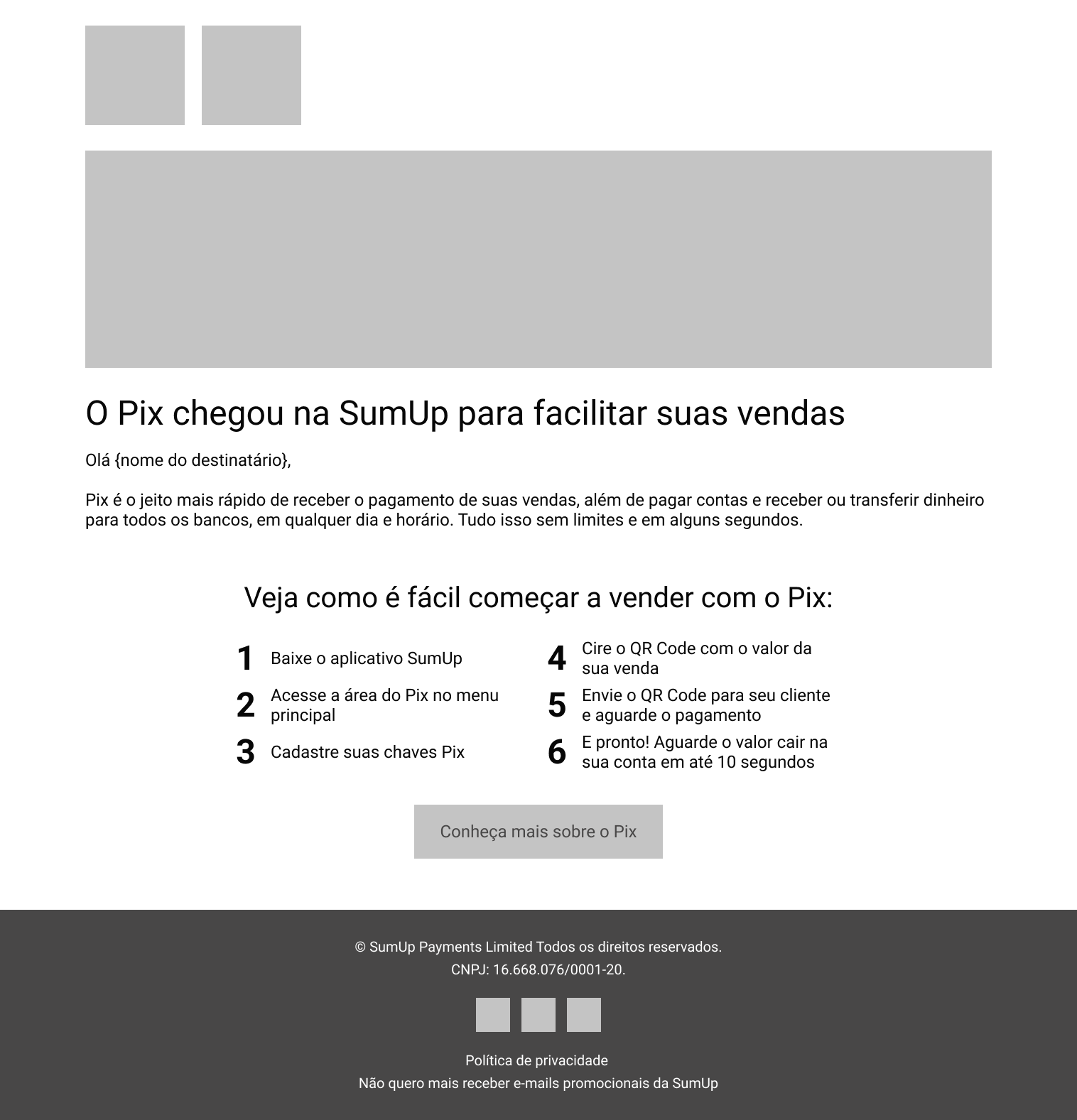
E-mail Marketing
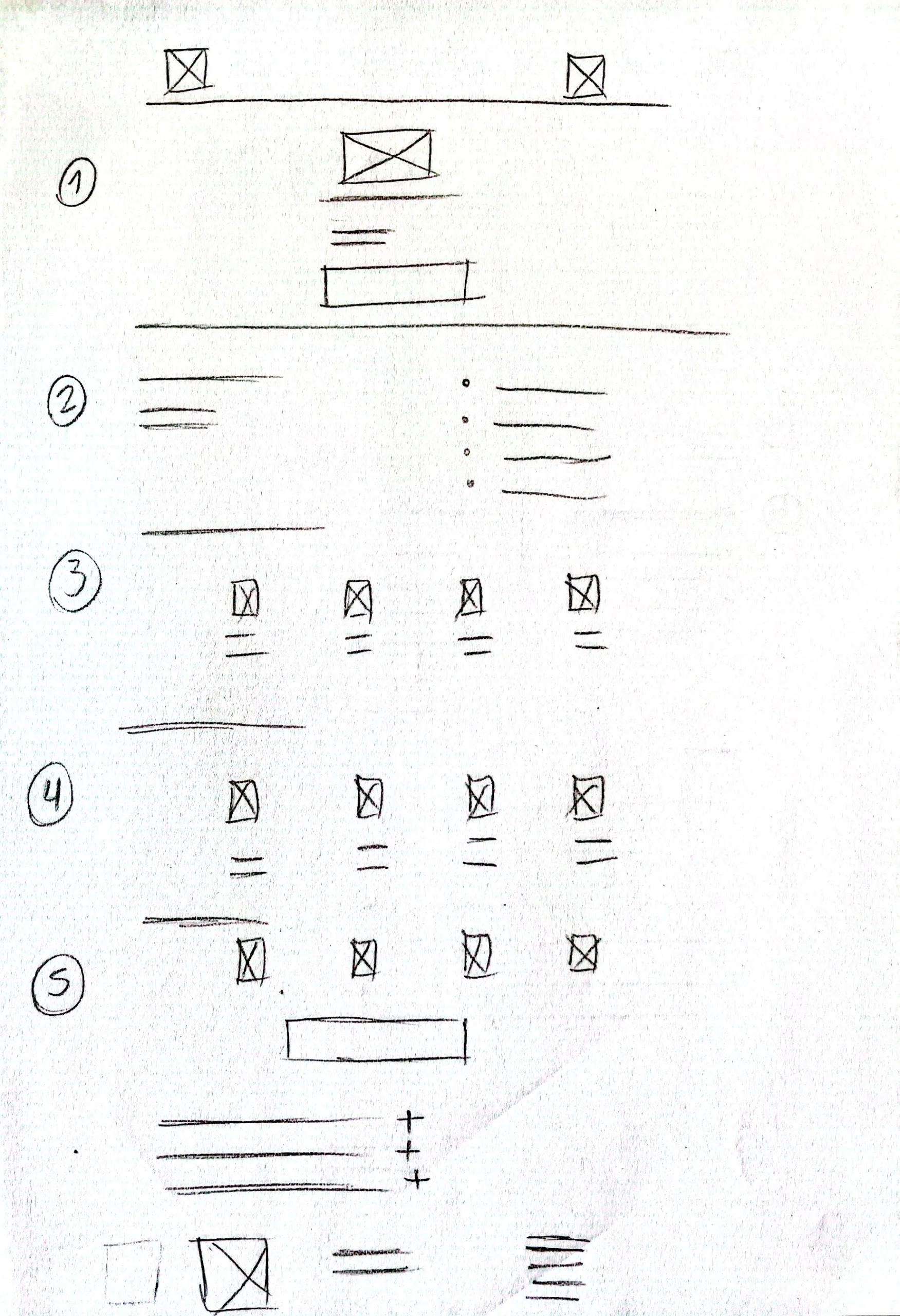
Mid-fi Prototypes
- Translated wireframes into mid-fi mockups in Figma for both the landing page and the email template.
- Focused on readability, scannability, and clear progression from “What is Pix?” → “Why use it?” → “How to set it up?” → “Get started”.
Landing Page
E-mail Marketing
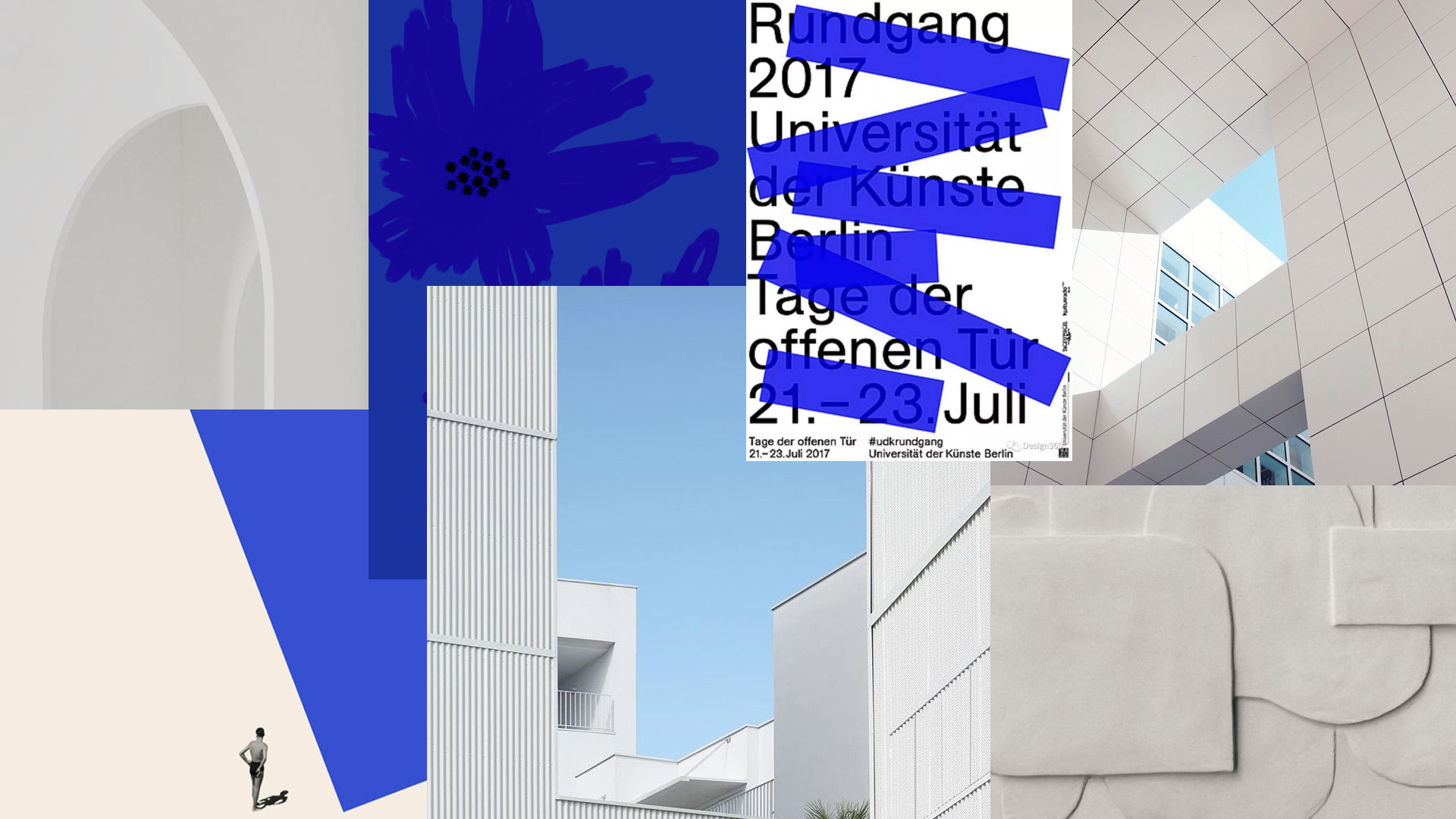
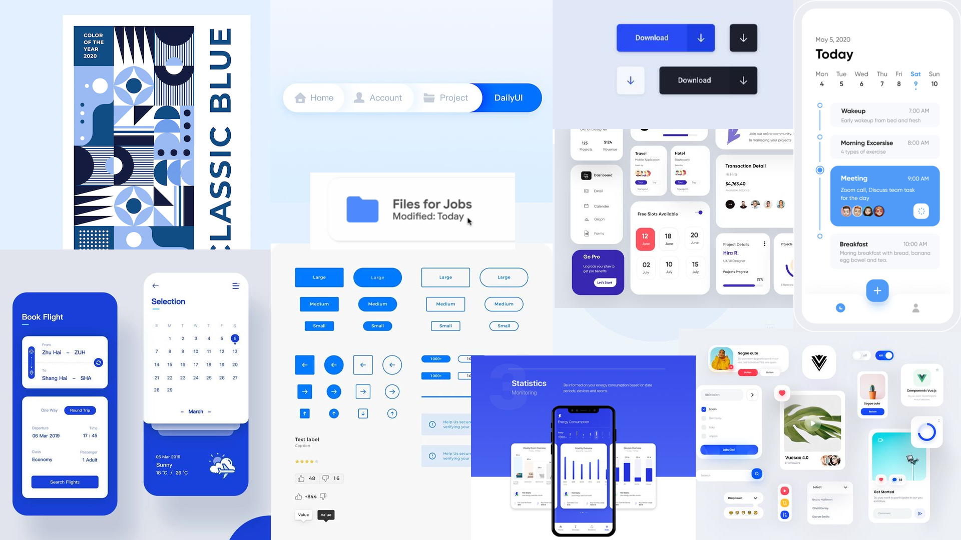
Moodboards
- Revisited SumUp’s and Pix’s brand guidelines.
- Created two moodboards:
A conceptual moodboard to capture desired brand values (transparency, intelligence, calm, modernity).
A graphic moodboard to anchor color palettes, typography, and iconography.
- Blended both brands by leaning on the stricter SumUp style guide (since this was a SumUp-owned channel) while weaving in Pix’s flexible visual guide.
Conceptual
Graphic
Style Guide
- Consolidated fonts, colors, button styles and grid/layout rules into a lightweight style guide.
Landing Page Typography

E-mail Marketing Typography
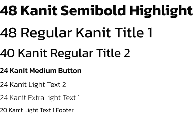
Color Palette

Key Visuals
- Based on the concepts of the moodboards and the result obtained in the style guide, I designed key visuals that set the look and feel for both the landing page and email.
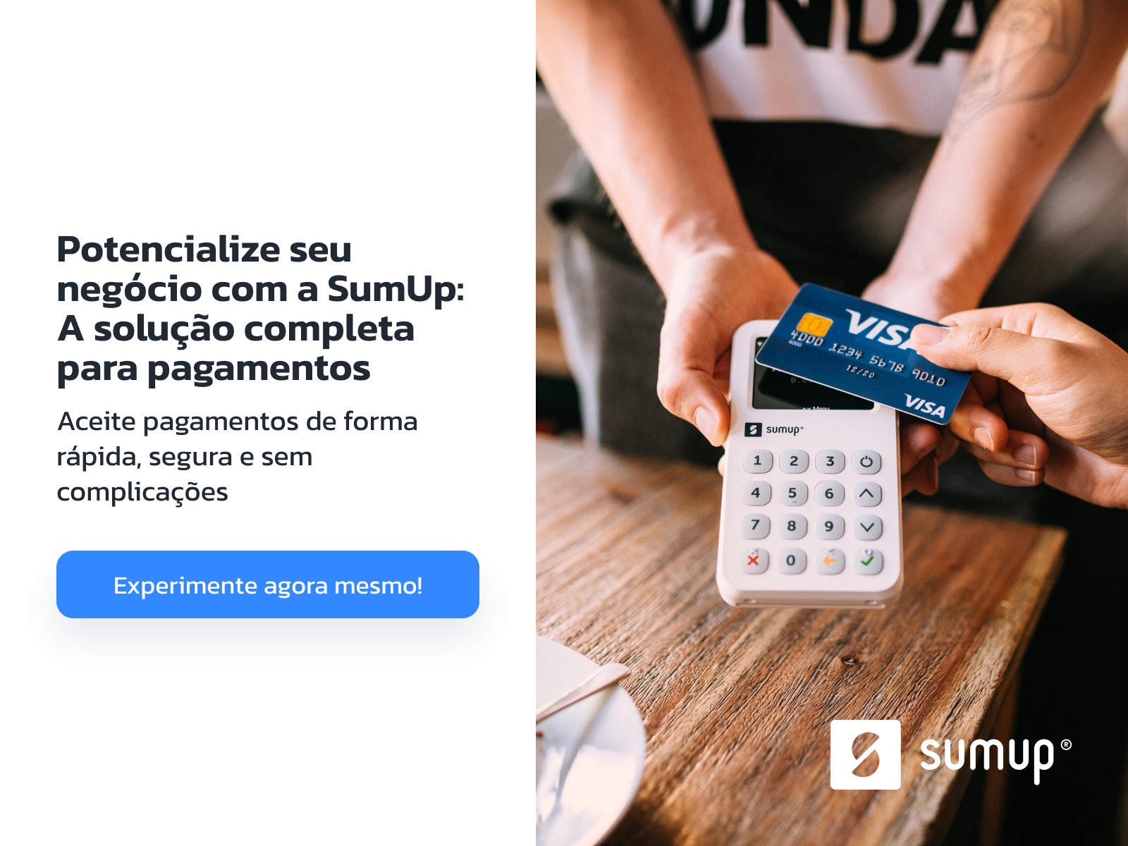
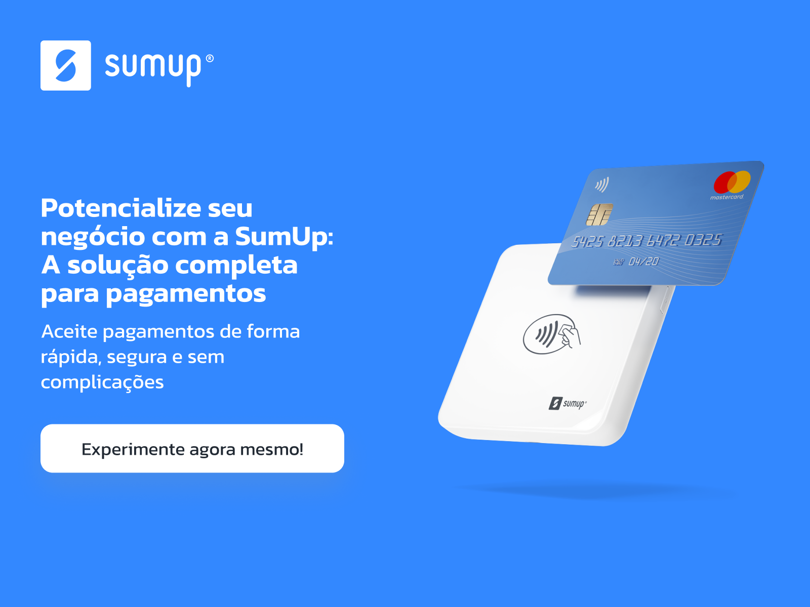
FINAL LOOK
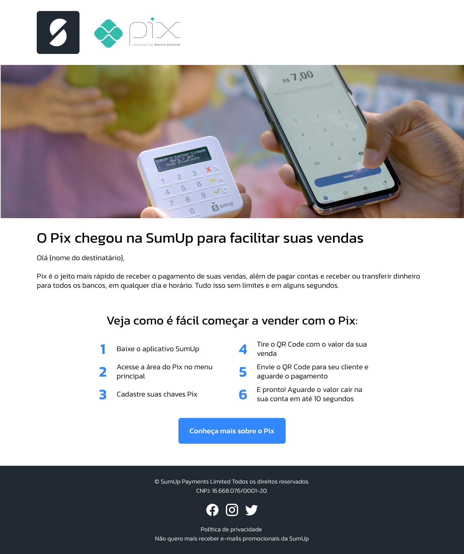
- Produced high-fidelity Figma prototypes for the landing page and email.
- Presented interaction flows, responsive layouts, and annotated specs ready for handoff.
Landing Page
E-mail Marketing